Editor's note: Sean Owen, director of data science at Databricks, discussed three situations where data provides ambiguous results and how causality can help clarify the interpretation of the data.
Correlation and causality
Correlation does not equal cause and effect. Just because the sales of ice cream and tanning cream are rising or falling at the same time does not mean that there is a causal relationship between the two. However, human thinking tends to be causal. You probably have realized that the sales of these two products depend on the hot summer weather. So, what is the role of causality?
Data scientists who are new to the industry may have an impression that causality is a topic that everyone avoids. This is a false impression. We use data to determine things like "Which ad will cause more clicks?" There is already an ecosystem of easy-to-use and open tools for us to build models based on data. We feel that these models can answer questions about causes and effects. When did they do it, and when did we mistake them for it?
There is a subtle gap between what data tells us and what we think data tells us. This is the source of confusion and error. Newcomers to the industry, despite being equipped with powerful modeling tools, may still fall victim to the "unknown unknown", even in simple analysis.
This article will demonstrate three seemingly simple situations that can produce surprisingly ambiguous results. Spoiler alert: In all cases, causality is an essential ingredient to clarify data interpretation. Exciting tools, including probabilistic graphical models and do-calculus, enable us to reason based on data and causality and draw powerful conclusions.
Two "best fit" straight lines
Consider the cars data set built into R. This simple small data set provides braking distances for different vehicle speeds. Assuming that the relationship between the two is linear at low speeds.
There is nothing simpler than linear regression, right? Distance is a function of speed:
Similarly, speed is also a function of distance:
Although it seems to be the same thing, in two ways, these two regressions will give different best-fitting straight lines. These two lines cannot be the best, so which one is the best fit line and why?
If you want to verify it yourself, you can view and run the code that creates the above two graphs: https://trial.dominodatalab.com/u/srowen/causation/view/main.R
Two best therapies
The following data set may look familiar. It shows the cure rate of the two treatments for kidney stones.
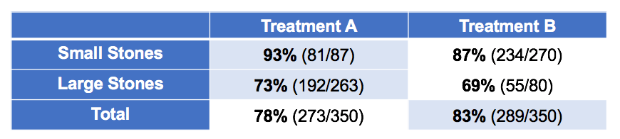
You may have noticed the strangeness of the above table. Overall, the cure rate of B therapy is higher. However, A therapy has a higher cure rate for small stones, and a higher cure rate for cases other than small stones (large stones). How can this be? You can do the math by yourself.
Many people will immediately realize that this is a classic example of Simpson's paradox. (This example is taken from the wiki page of Simpson's Paradox.) It is important to realize this. However, realizing this does not answer the real question: Which treatment is better?
Here, A therapy is better. Larger kidney stones are more difficult to treat and generally have a lower cure rate. In these more difficult situations, A therapy is more often used. Although A therapy is actually better, because it is more often used in difficult situations, the overall cure rate is lowered. The size of the stone is a confusing variable, and the horizontal rows of the table control the size of the stone. So, it’s not wrong to control all variables like this to avoid paradoxes?
Consider the following data:
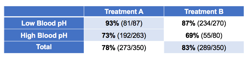
This time it is grouped according to the blood acid of the patients after treatment. Based on these data, which treatment is better? why?
Illusory relevance
Finally, consider the mtcars data set built into R. It provides statistics on some car models in the 1970s, such as engine cylinder capacity, fuel efficiency, number of cylinders, and so on. Consider the correlation between drat (rear axle reduction ratio) and carb (number of carburetors—the current car does not use a carburetor, but instead uses an electronic injection system).
There is almost no correlation (r = -0.09). This makes sense, after all, the gear design and engine design are actually orthogonal. (I admit that this is not the most intuitive example, but it is the easiest example in the simple data set built into the R language.)
However, if we only consider models with 6-cylinder or 8-cylinder engines:
There is a clear positive correlation (r = 0.52). What about other models?
There is actually a small positive correlation (r = 0.22). The two variables are related in part of the data, and are also related in the remaining data, but not in the overall data. How could this be?
The answer lies in causality
Of course, these questions have answers. In the first example, the two different lines are derived from two different sets of assumptions. Distance ~ Speed ​​regression means that distance is a linear function of speed, plus Gaussian noise, and the straight line minimizes the mean square error between the actual distance and the predicted distance. The other straight line minimizes the mean square error between the actual speed and the predicted speed. The former corresponds to the assumption that the difference in speed leads to the difference in braking distance, which makes sense; the latter implies that the difference in distance leads to the difference in speed, which is meaningless. So the straight line derived from distance ~ speed is the correct best-fit straight line. However, information other than data is needed to determine this.
The idea that different speeds result in different braking distances can be represented by a (very simple) directed graph:
Similarly, in the second example of Simpson's Paradox, blood acid is no longer a confounding variable, but a mediating variable. It does not lead to which treatment is selected, but which treatment is selected leads to different blood acid levels. Using it as a control variable is equivalent to removing the main effect of the therapy. In this case, therapy B looks better because it leads to lower blood acid levels, which leads to better results (although therapy A does seem to have some positive secondary effects).
Therefore, the original scenario of Simpson's Paradox is:
And the second scene is:
Similarly, the "paradox" here can be resolved. External information about causality resolves the "paradox"-the two scenarios are resolved in different ways!
The third example is an example of Berkson's paradox. Assuming that the rear axle reduction ratio and the number of carburetors affect the number of cylinders (not discussed here, it is assumed that this is true in the engine design), then the conclusion that the rear axle reduction ratio and the number of carburetors are not correlated is correct. Controlling the number of cylinders creates a non-existent correlation, because the number of cylinders is a "collision" variable that is simultaneously related to the reduction ratio of the rear axle and the number of carburetors.
Again, the data does not tell us this; knowledge of the causal relationship between variables can lead to this conclusion.
Probabilistic Graphical Model and do-Calculus
The probabilistic graphical model (PGM) we draw above has its purpose. These diagrams express the type of conditional probability dependence in the cause-effect relationship. Although the probability plots for the above situations are trivial, they can easily become complicated. However, no matter simple or complex, we can detect the relationship between the variables needed to analyze the data correctly by analyzing the probability graph.
PGM is an interesting subject. (There is a course by Daphne Koller on Coursera.) Understanding the importance of causality and how to analyze causality to correctly interpret data is a necessary step in the journey of a data scientist.
This type of analysis leads to a capability that may be more exciting. What happens if a variable takes a different value? It is possible to make this reasoning. This idea sounds like a conditional probability: given that today’s ice cream sales are high (IC), what is the probability that the sales of tanning cream are high (ST)? That is, what is P(ST|IC)? Based on the data set, this is easy to answer. If the two are positively correlated, we can further expect P(IC|ST)> P(IC)-that is, when the sales of tanning cream are high, the probability of ice cream sales is higher.
However, if we increase the sales of tanning cream (maybe credited as do(ST)), will the sales of ice cream increase? It is clear that P(IC|do(ST)) and P(IC|ST) are not the same thing, because we do not expect a causal link between the two.
Does the data only provide simple conditional probabilities? Is it possible for us to calculate counterfactual probabilities that have not occurred in the data, so as to judge these assertions about actions?
The surprising answer, yes, it is possible with the help of the causal model and the "do-calculus" proposed by Judea Pearl. do-calculus is the subject of Pearl's new book The Book of Why. This book summarizes the history of causal thinking, Bayesian networks, graph models and Pearl's own significant contributions to this field, and is highly recommended here.
Perhaps the most fascinating presentation of do-calculus is this book's retrospective analysis of cancer-related research on smoking. According to Pearl, whether smoking causes cancer through the accumulation of cigarette tar in the lungs, or whether it is due to unknown genetic factors that also lead to the liking of smoking and the susceptibility to lung cancer. People have questioned this. Unfortunately, this genetic factor cannot be observed and cannot be controlled. It is easy to make inferences by drawing the implicit causal model.
Even when it is uncertain whether genetic factors exist, is it possible to answer the question "smoking causes cancer"? Is P(cancer|do(smoking))> P(cancer)?
It is possible to do this by applying the three basic rules of do-calculus, and the specific details will not be expanded here (please see the paper and book). After applying the do-calculus rule, only the conditional probabilities of smoking, cigarette tar, and cancer are involved. These can be derived from the actual data set:
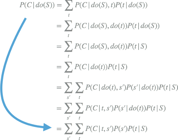
Only through the conditional probability in the data, even without knowing whether there are unknown confounding variables, it is possible to know whether smoking leads to an increased risk of cancer.
Concluding remarks
Experienced data scientists not only know how to use tools as black boxes, but also know that the correct interpretation of models and data is often ambiguous and even counterintuitive. Avoiding common misunderstandings is a sign of experienced practitioners.
Fortunately, many such paradoxes have common sources, and through reasoning based on the cause-effect network, these sources can be analyzed to resolve these paradoxes. Probabilistic graphical models are as important as statistical methods.
Coupled with do-calculus, we can make some interpretations and analyses based on data. For those who are used to believing that they cannot get causal or counterfactual conclusions from data alone, these interpretations and analyses are amazing!
What features you consider more when you choose an university laptop for project? Performance, portability, screen quality, rich slots with rj45, large battery, or others? There are many options on laptop for university students according application scenarios. If prefer 14inch 11th with rj45, you can take this recommended laptop for university. If like bigger screen, can take 15.6 inch 10th or 11th laptop for uni; if performance focused, jus choose 16.1 inch gtx 1650 4gb graphic laptop,etc. Of course, 15.6 inch good laptops for university students with 4th or 6th is also wonderful choice if only need for course works or entertainments.
There are many options if you do university laptop deals, just share parameters levels and price levels prefer, then will send matched details with price for you.
Other Education Laptop also available, from elementary 14 inch or 10.1 inch celeron laptop to 4gb gtx graphic laptop. You can just call us and share basic configuration interest, then right details provided immediately.
University Laptop,Laptop For University Students,University Laptop Deals,Recommended Laptop For University,Laptop For Uni
Henan Shuyi Electronics Co., Ltd. , https://www.shuyilaptop.com